Illustrator tutorial : Death Goddess by Adobe Here’s how to create a clean and detailed tattoo-style design, in Adobe Illustrator. For this Illustrator tutorial you will use the pressure sensitive…
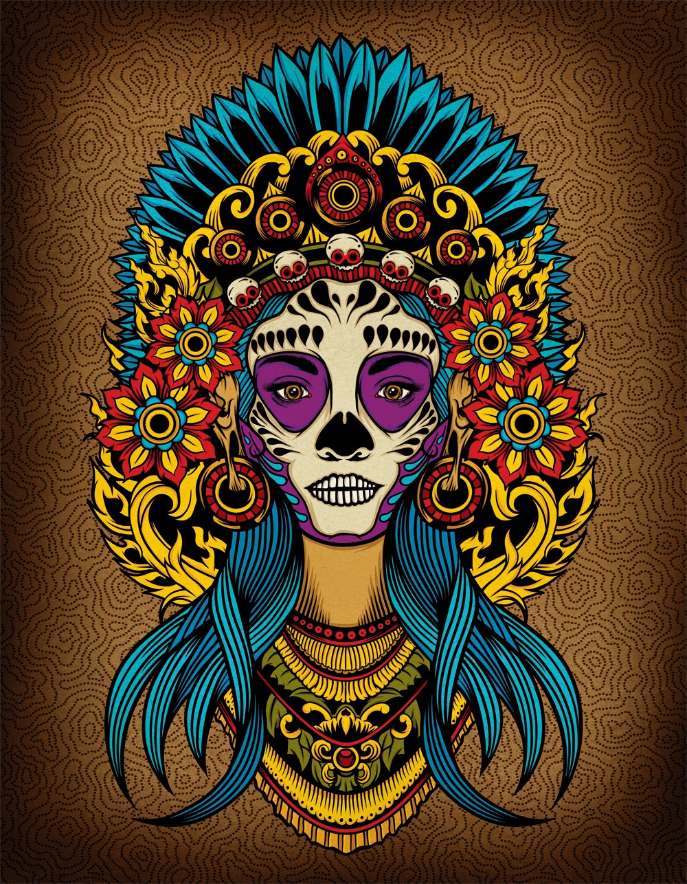
Illustrator tutorial : Death Goddess by Adobe Here’s how to create a clean and detailed tattoo-style design, in Adobe Illustrator. For this Illustrator tutorial you will use the pressure sensitive…
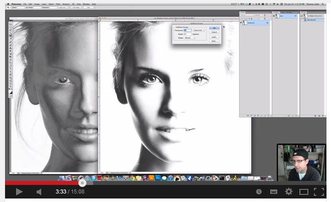
This a very useful tutorial on how to make halftone color separations for four color process printing in Adobe Photoshop. These are just some simple tips and for further insight…
Being on the internet all the time, I tend to read lots of blogs concerning graphic design. Well, today I’ve found a really cool tutorial, explained step by step for…

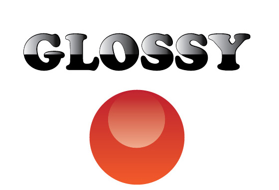
I’m not sure if my other tutorial about glossy text using the opacity mask was useful to someone, taking into consideration the fact that there are so many awesome sites…
In order to achieve a specific good-looking final design, many designers have their own tips and tricks for that. I will start a series of tutorials, in a step by…
Since we’ve received lots of requests regarding our t-shirt designs and how could they be easily color separated for screen printing and printed, we will start with a small video…
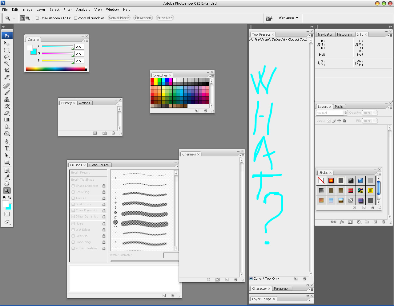
You might remember part one of this article, where I talked about such topics as how lame my digital skills used to be and how doing certain things in Photoshop…
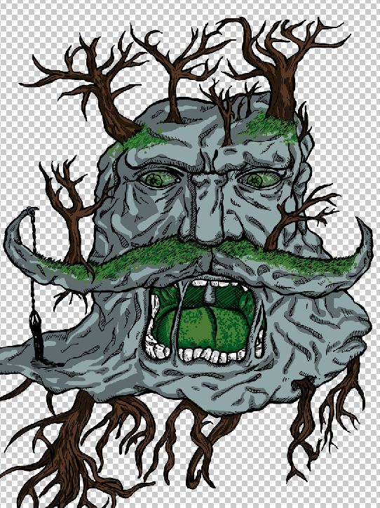
Shading colors tutorial ! Colors – we talked about how to lay the flats on our artwork, but this alone sometimes just doesn’t cut it. As I said, having only…
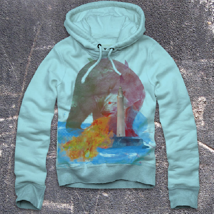
Revolutionary Hoodie Customization Package from Go Media on Vimeo. Let’s say that you are done working on a design and now it’s time to show the client your hard work….