Revolutionary Hoodie Customization Package from Go Media on Vimeo.
Let’s say that you are done working on a design and now it’s time to show the client your hard work. Well, if this is the case, you probably know that before you send the final file you need to send some mock-ups for approval. In case you have everything done, sending at least 2 preview files is the right thing to do. Have you noticed how on most design contest sites you are required to upload at least two files, one showing a detail of the design and one showing it on a mock t-shirt? That is because it is important to present your customer with a realistic presentation of how the final product will look like. And the detail picture is in order to show off the parts you consider look best and can’t be seen on the mock-up. So, in order to make a good impression, it’s highly recommended that you use a photo-realistic mocking of the final product. That way, both you and the client can see how the printed graphic would look on the t-shirt, hoodie, shoes, etc.
This is a short guide made of tips and tricks compiled for a higher success rate in your presentations. I will use Photoshop for this one. First of all, you need a mock of a blank t-shirt, or hoodie, or whatever you are designing for. I highly recommend GoMedia’s apparel templates, a set of high-res pictures of blank tees, in many colors and variations, perfect for a professional designer. If you choose to create your own set of mocks, that’s fine, you can do that too. So, first thing’s first, Google it, try to find both blank mock-ups and models wearing blanks, those will come in handy. I recommend using those images that pose no copyright issues, and a good place to start is the Flickr blank tees group.
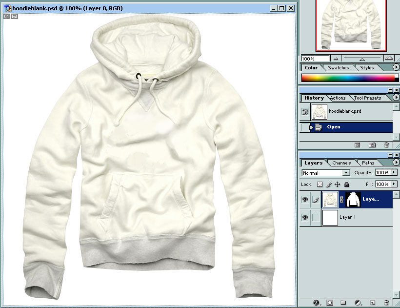
Once you have your blank tee, you need to separate it from the rest of your image. We do this so that we can change the color and contrast of the t-shirt without affecting the rest of the image. So, using whichever selection method you like, select the image of the t-shirt and copy it on a new layer, above the rest of the image. I prefer the pen tool for drawing an outline and then convert it to a selection path, because it gives me more precision in selecting all the folds and contours of the tee. For exemplification purposes I will use Jon Kruse’s hoodie mock up I got from Mintees. So, now you have your tee on a different layer, ready for action.
Mock-up tutorial
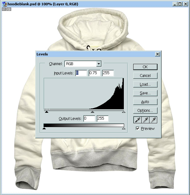
Now, we need to adjust the levels of the image, in order to improve the contrast/color hues of the mock, depending on the way we need the distinctive folds of the tee to show under the design. Do so by pressing CTRL+L and playing with the sliders.
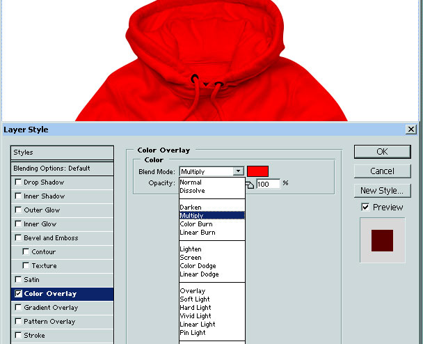
Also, now we adjust the color of the mock. We do that by going on its respective layer and we select Blending Options. Now, go to Color Overlay and click it! RED! Next we need to go to the color overlay’s settings and change its blending mode to multiply. From here on, it’s pretty self-explanatory, you select the color of choice and see the mock getting all colored up. On to the placing of your design!
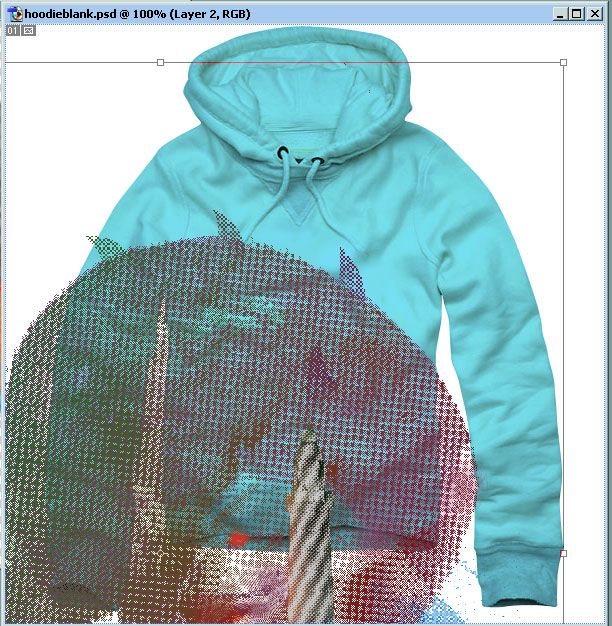
Well, the design should come on a layer above everything else. I recommend merging all the layers of the design, and then copying the resulting layer over the blank mock. Do not forget to unmerge the layers of your design. Do so by pressing CTRL+Z or edit/undo. Sure, this copying will result in everything getting covered by the large high res copy of your design, but now we press the magical combination of CTRL+T (or right click and select Free Transform), and we resize the design to fit the surface of the mock. Please hold the shift key while resizing, in order to keep the proportions of the design locked. Or don’t, and see what happens, but I’ll be all like “Told you so, ha!”
We press Enter when we are happy with the overall sizing of the design, and what we have is a pretty decent mock-up. But that is not enough if you want to really impress.
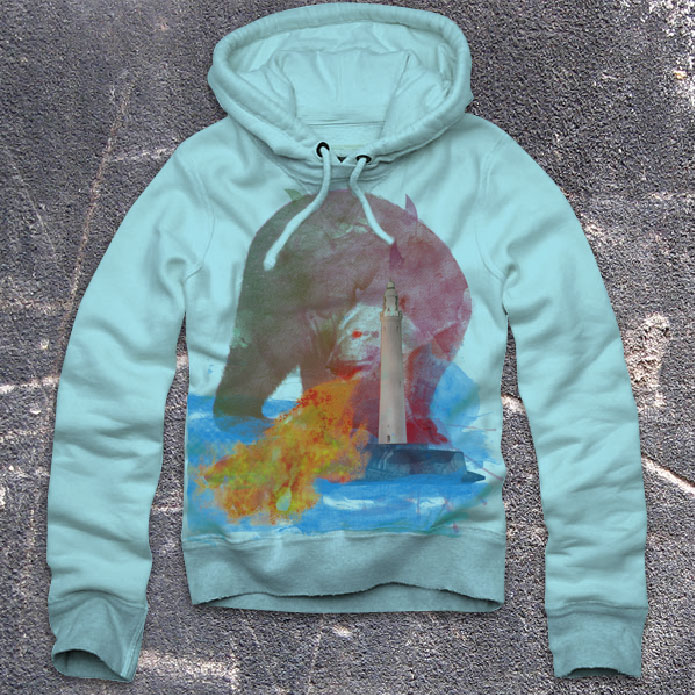
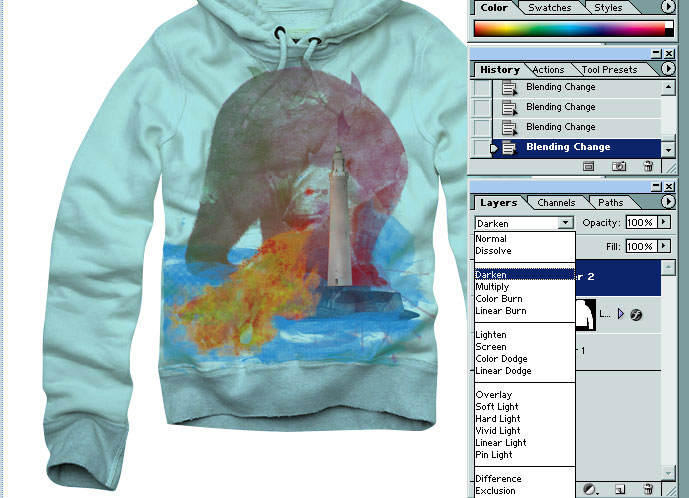
We need to make the design blend into the mock, and this requires some experimenting with Blending Modes. Click the layer with the design, and see the box next to opacity that says normal. Well, you make it say something else. Try to find the blending mode that saves as much of the designs original colors as possible. Notice how the folds of the tees show under the design? That makes it feel more realistic.
Now, all you have to do is find a good background image for your mock and you are set to go. Note that there are plenty of ways to do this, I only talked about one of them.
In our flikr showcase you can see more professional mockups made by Barkone, featuring his sweet t-shirt designs.
Experiment, try things out and you are bound to find your own way of doing things. Your customers will appreciate the time and effort you put into doing this, and you will benefit from that a lot!
Hi, that was without a doubt an awesome read. I had actually been looking for a photo printing related blog for a while now. Appreciate it! I have a similar blog, how much do you charge for advertising? because I can’t seem to find the information anywhere.
Hi there any chance off get sent a copy off this mockup, please 🙂