Pop Culture Typography
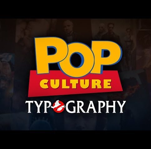
Three words that trigger instant nostalgia: pop culture typography. When I saw the title I immediately thought about The Simpsons, Star Wars, The Godfather, Harry Potter, Coca Cola, Back to the future and Stranger Things. I played the video and I was not one bit disappointed.
Izac Less posted a few days ago the said video, on YouTube. It’s skyrocketing in views thanks to its pop culture references, all crammed in a little over 3 minutes. He’s challenging you to recognize as many typographic logos as possible, while taking you down graphic design memory lane. It took around a year to make, although by watching it seems like a lot more work went into it.
I mean, he included Sega and My Brother, My Brother and Me? Did you catch those? In the off chance you have a bit of difficulty recognizing the references, there’s a labelled version of the video is available here.
This goes to show how powerful fonts and typography are in creating a brand’s identity. It’s a language in its own with each line, color and alignment assembling into an iconic title.
I am sure you’ll be smiling while watching this video! You will be surprised at how much pop culture knowledge you hold inside.


Leave a Comment