Ben the illustrator
Obviously, this is a guy named Ben, another one who does illustration.
Only he’s definitely not just another creative in the great pile of graphic designers. The About section on his site comes to attest to that. Instead of throwing together a bunch of cliches, he presents his identity as a creative in the form of an illustration. How many artist do you know that can pull this off? It may seem easy in theory but in practice it’s much, much more complicated.
But it’s not just that. He included a few testimonials from collaborators, such as the Director of Made You Look, the NYC Director DOT Art and Event Programming, Emmy Award winning set designer James Pearse Connelly, Hasbro designer Matt Mattus and Kim Sillen, Graphic Designer for the NYC Department of Transportation. Their words are able to best describe what this guy is really about: professional, intuitive, dependable, and last but not least, extremely creative.
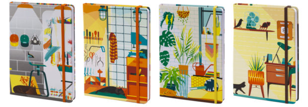
And his choice of such a simple pen name speaks volumes about his style: minimalist, a kind of simplicity that makes you curious to know more. It pulls you into a kind of „Where’s Waldo?” world. Although simple is not the word I would go for. „Condensed” would be more appropriate.
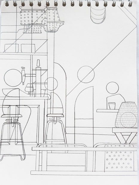
The play with geometry reveals a wide perspective filled with info about what he depicts. He’s able to showcase the essential message behind his designs in such a transparent way. Many artists mask their lack of understanding or inability to render the main message with cluttering details. Not Ben.
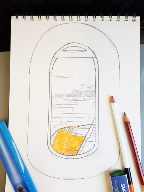
Ben O’Brien goes through a very ritualistic process, with all his projects: research, simplify, draw, color. One of his most recent works was for none other than the The Guardian.

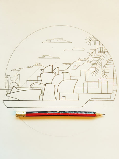
On his site you can see most of his work with details about each commission. I loved this one called Bilbao, which includes images of his sketches. If you’re like me and enjoy peeking behind the scenes, make sure you also follow his Instagram.






Leave a Comment