Logo Design Secrets

Well, not really a secret when it’s splattered all over this blog. But you would consider them as such, since not everyone can actually achieve them. Some master logo design better than others. I think that is a secret we’ll try to explain, and it all relies on relative things that make up each individual – some things that work for one, will not work for the other. So, you are one of those individuals interested in logo design. Let’s help you out with that !
There is no secret ingredient (Thank you, Kung Fu Panda!) but you should try following a few basic design steps that would fire up creativity, productivity, focus.
In broad terms:
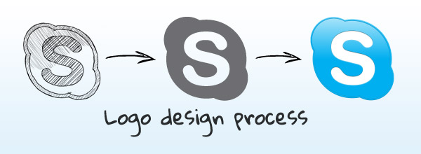
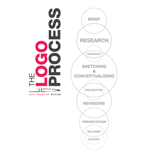
the process begins with questions – a lot of them, as many as possible – followed by research, sketching, the first draft of the DESIGN and then rinse and repeat.
Vital to creating a unique logo are: color, font, layout, size, effect.
Match the FONT with the SHAPE style, and a TIP – Two font styles co-exist in one logo at most.
The LAYOUT should be as simple and clear as possible, because they are easiest to remember.
In terms of COLOR, you should adhere to the industry the business belong to, so use cold colors for Corporate, IT, Finance, Government, Banks. Use warm colors for Food, Beauty, Health, Entertainment. As a TIP, three colors co-exist in one logo at most.
To put it in pretty words but not so specific, a great logo is:
Distinctive: unique , different, must stands out from the crowd.
Visible: noticeable or easily seen.
Adaptable: able to work on numerous products, like a t-shirt, a cup, online, on a truck, on a road sign. Think of as many outlets as possible.
Memorable: unforgettable — once someone hears the name of the business, the logo pops up to mind as well. It must be easy to remember. This is why simplicity and minimum number of colors will help.
Universal: carries a consistent meaning to a diverse range of people.
Timeless: not based around current design styles. So be careful how you use your research – don’t get carried away by trends.
Simple: in it’s purest from, free from unnecessary details.
Tip: take your friends and relatives opinions with a pinch of salt. Focus on your vision and when necessary on the client’s/business’s concept. Ideally, you can have freedom to work around any idea you see fit.
Well, logo design is brand identity; it must communicate the company’s personality and goals. So think of it as more organic, as a spokesperson that will do the talking for every product or service the company sells.
We know, the secrets are not actually out; the internet is full of “how to’s” but you came here for advice, for a guideline. Take this post exactly like that – a guideline and make sure you also click the links below! Because, boy do they offer some insightful recommendation for you to follow when engaging into a logo project!
1. The 7 step Paul Rand Logo Test.
2.45 Rules for Creating a Great Logo Design
3.THE DO’S AND DON’TS OF LOGO DESIGN
4.What makes a logo design effective
Help us out with other links to add, in the comments.


Leave a Comment