Updated: February 4, 2021
Reactions to the new Instagram Logo
All the tension, aggression and indignation has died down so we can rationally talk about what happened to the Instagram logo and all other icons for the company’s apps. In short, people were not that happy about the redesign, while some thought that it doesn’t even matter. I read many comments from users that refused to update in order to keep their old logo on their mobile devices.
It seems that all the colorful gradients made the final result seem rushed, amateurish or old school.
But is everything that simple?
Let’s see why people hated it:
– it seems like the designers used almost the entire color palette
– flat design is in trend but not always suitable
– the awful gradient is everywhere
– it has no unique character
– the old rainbow was characteristic and the new bright colors try to encompass the diversity of the community’s interests, but the new version is not reminiscent of the old rainbow in any way
–the final result looks generic, similar to other photo apps
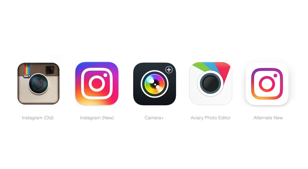
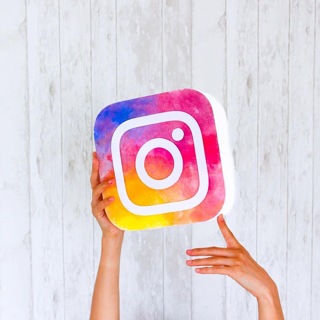
So, the previous retro-looking camera, extremely recognizable among other tech logos out there, was replaced by a background swirl of sunset colors (orange, yellow, pink, purple) and a white outline of a camera. As one put it: “As if the camera was murdered, and chalk was drawn around its body. Murdered at sundown”.
Others say that indeed the logo was outdated and it was in dire need to simplify the lines, give up the many details and textures it featured. It was only a matter of time before it gave up the much-loved icon, because we mostly use the app on mobile devices and all those beautiful details get lost anyway.
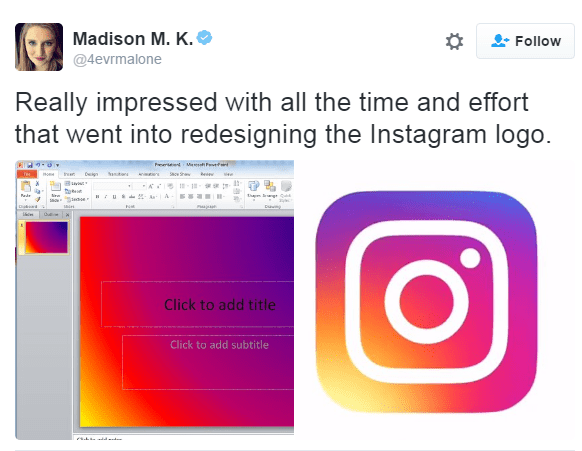
And, as with all very high profile changes, there were plenty of designer jokes floating around, and this was among my favorites:
We could all agree on the need for an upgrade but even supporters of the new design are not sure it will stand the test of time. Here is what they say makes this logo a good move:
– it gave up the icon’s skeuomorphic style to step into a new era, by simplifying it
– we can still recognise the basic instagram lens in a simplified white outline
– the logo is colorful and vibrant, as opposed to the dull, old one
– color has always been a key part of Instagram’s appeal – think filters-, and the new chromatic scale is a reflection of that energy
– The new design is more simplistic and cleaner
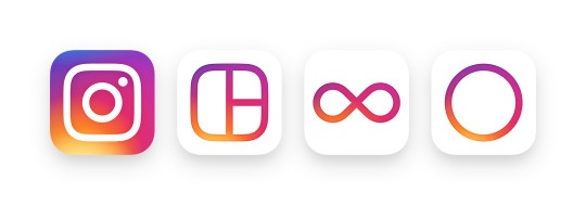
In addition, the user interface has also changes to more simplistic lines, with a white overall background, focusing your attention on the pictures or videos themselves. This seems to be everyone’s cup of tea though, so no arguing about that.
It may be that the rejection of the logo icons comes from the fact that the app is obsessively used by everyone which leads to a familiarity you cannot let go of that easily. And this happens for all things we use so much, every day. Maybe the change is not a catastrophe but just a matter of getting used to it. Because we will definitely not give up using it just because you are bothered by the bright gradients, right?
You can now answer this rather rhetorical question since it has been a month since the change. If you hate the redesign, did you stop using the app or even reduce the time spent on it?
My guess is no.
Here is the promo video showing the process behind the redesign:
And here is what the public saw:
So, what do you think? Yay or nay for the new logo and how do changes like these affect big, established (tech) brands such as Instagram?
Leave a Comment