A fascinating walk into the handlettering world of Olga Zakharova
You know us and our obsession for typography design. So why not delve deeper into this world, with the help of a very talented illustrator, who caught our eye while browsing the very resourceful Creative Market. If you know the quality level on the site, you understand how hard it is to stand out.
Well, we loved Olga Zakharova so much that we wanted to know more about how she creates such lovely fonts, that seem to effortlessly blend with the elegant background she chooses for each of them. Just as expected, there is a lot of work and dedication behind every illustration, and the attention to detail is something that not all know how to master. But Olga is one of those people who turns details into real art. Read the interview and see what we mean 🙂
OANA: Please tell us more about your art and design background. What made you become a designer?
OLGA: I was actually never planning to become a designer or an illustrator. I loved to draw when I was a child, but I never learnt how to do it properly and I always thought that I am not good enough in this. So I chose a different path – I became a journalist, worked for several years as a sport reporter in one of the oldest sport newspapers in Russia. Then I decided to change profession, got my second diploma and became a psychologist. But then my husband and I decided to leave Russia and went to live in Thailand – it was difficult to continue what I was doing before because both of specialties require Russian language to be spoken. At that time we met some people who were earning money by creating illustrations for microstock sites. I thought it won’t hurt to try, read some information about vector illustrations on the web, opened Illustrator and created 10 vectors for an exam. I passed it from the first go and that’s how my journey started.
After that I spent hundreds of hours learning about design, illustration, logos, color, shapes, – basically everything that is somehow connected to visual arts online. I believe that education is a life-long process, so I try to learn as much as I can every time I get a chance. And I think I am still becoming a designer.
OANA: How or when did you start illustrating on a professional level?
OLGA: About two years ago, when I started working not only for microstock sites, but for private clients and businesses.
OANA: Where does your inspiration come from?
OLGA: For me inspiration is in some way similar to love – it’s some strange sort of chemistry that is so difficult to explain and at the same time so easy to feel when it’s there. It definitely has something to do with passion, desire to speak through the drawing or design, believing in your abilities. And, of course, good cappuccino helps too.
OANA: How would you describe your style?
OLGA: Organic, with harmonious relations between negative space and objects and a bit of humour.
OANA: What tools you use? Do you go 100% digital or is there paper involved?
OLGA: My «toolbox» consist of mechanical pencil, ink pens (different sizes), eraser, light table, scanner, Wacom pen & pencil tablet, macbook. Also I use regular «printer-quality» paper. I travel a lot, so I tend to have only things that I actually use.
I always start with a paper sketch. First thumbnail sketches are usually done by ink pen (so I won’t feel an urge to correct every line), then I move to the cleaner version which I make with a mechanical pencil, than I do ink version and only after that I scan it. I would say that I spend 50% of time working analog. For me it’s easier to correct most of things on paper. Recently I’ve shared my process on the blog of my website.
OANA: Is there anything that you specifically avoid using in your illustrations?
OLGA: Drawing people. I can do that, but I am never very happy with the result. Before I was self-conscious about that and even wanted to go to some «anatomy drawing» classes, but then I realized that there are so many things that I can draw and enjoy it at the same time, that I don’t need to spend this time trying to learn what I don’t like.
OANA: What was the hardest job/illustration you have ever worked on?
OLGA: Probably my first job that I did for a client. The design itself wasn’t that difficult – it was an infographic about a taxi company that they were supposed to show to the investors to attract more money. But the client made my life a living hell for some time. However it was a great lesson: don’t ever agree to work with a client, if from the start you feel that you are not on the same page (and probably even not on the same book, hell, you are in the different library!). Everything was supposed to be done «yesterday», each time I’d show him a design he would say something like «that’s wonderful, but we need to change (huge list of corrections to follow)».
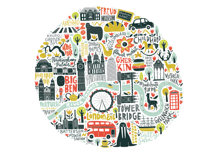
Technical-wise one of the hardest illustrations I’ve done was a map of Paris. I wanted to draw everything by hand, so I needed to do it all in the certain scale and so I needed to use few A4 papers. Also I wanted to maintain a certain level of «occupancy» throughout an illustration and it’s difficult to achieve when you’re dealing with maps, because you will always have most of the interesting objects in one place and none of them in others. But once I gave myself creative license and start to make bold decisions regarding which places I would draw and which I would skip, it went great. Creating maps is one of my biggest passions and I would love to pursue it further.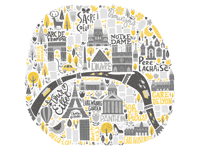
OANA: Any graphic designers you admire?
OLGA: If I were to name them all of them it would be a huge list, so I’ll name a few. Von Glitschka – I’ve always admired his humour and his personality that comes through all his illustrations. Steve Simpson – great professional, love how he uses the space, textures, colors, I can look at his illustrations for hours. Mary Kate McDevitt – amazing lettering artist, who manages to mix different styles in one illustration very well. Linzie Hunter, who does wonderful and very complicated lettering pieces, used texture and color very wisely.
OANA: Any words of advice for anyone just starting out as an illustrator/graphic designer?
Don’t be afraid to be different. Try to feel something when you are creating illustrations or designs – the world has too many empty things already, don’t create more. Try to put your emotions into what you are doing and it will make you better. Practice every day and share your work even if you are not 100% happy with it – illustration is not about perfection, it’s about development and process. Believe in yourself. If you don’t – find somebody that will, every artist needs a support system, I wouldn’t become who I am and won’t be where I am without my husband, who is always telling me that I can do anything if I really want to. You can do anything too, I truly believe in that.
Leave a Comment