Shading colors tutorial !

Colors – we talked about how to lay the flats on our artwork, but this alone sometimes just doesn’t cut it. As I said, having only lines or lines and flat colors is fine, sometimes even better than an elaborate detailed thing – it all depends on the design you are doing.
In most cases, if the number of colors is not very strictly set at 1-4, the best way to give your design depth is by shading and highlighting it. And this part of creating a design, be it vector or raster, is what I am going to write about here.
For this tutorial I will have to assume that you are familiar with basic shading theory. Yes, the part that says “see where the light falls on the object, use shadows on the opposite side of light, etc.” If you feel you need to improve that aspect, read my good friend Nick’s tutorial on the matter.
My focus will be on the actual method of rendering shadows and volumes, some tips and tricks on how to improve your speed and quality of the shading. Again, I hope this will help as many readers as possible, so I am going to use the mouse for these operations. Yes, for the simple reason that everybody has a mouse.
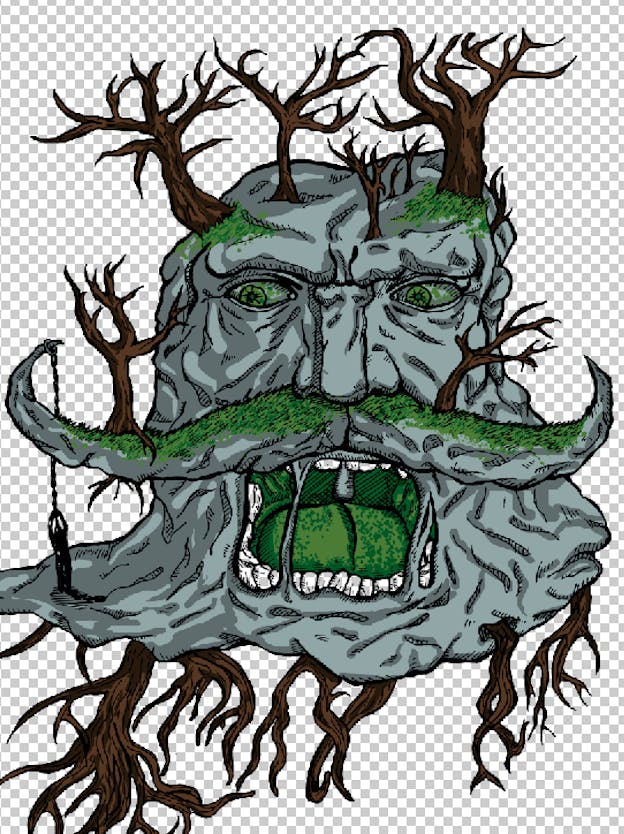
I will show you how I do my shading on this piece I explained my way of getting the flat colors on your artwork.
First, of course, we create a new layer. Because I am going to start shading the bluish color first, I am going to put my new blank layer above the one with that particular color.
Now, in order to keep things as clean as possible, I will select the flat color with the magic wand tool. That way, when I shade I won’t go outside the outline of that color.
Once you have your flat color selected, go to the new layer you created before. Then, use the color picker tool to select the flat color you are going to shade. Once you have selected that color, choose a darker color of the same hue. Great, now, let’s paint.
I start by doing very large strokes to get a feeling of the direction of the shadows. Then, with a smaller brush size, I add the main shadows. Go from larger brushes to smaller ones, in steps, that way you make sure you are getting the details done.
Now, I grab the eraser tool and…erase stuff. Mainly where the shading is too thick, or where I want some shapes to pop out.
Once you are done with one flat color (i.e. you are finished shading it), you can move on to the next one. The process is the same: new layer above the flat color, select your darker hue, magic wand the flat color and paint in the blank layer.
That’s how I did with my trees. Also, as a tip, when selecting more areas of the same color with the magic wand, hold shift and click those areas in order to add them to the same selection.
Have I mentioned you can convert this in vectors? If you do your color black on each layer, then copy/paste it in Illustrator, you can live trace it, expand it and delete the white. Then, align the layers and change their respective colors from black to whatever you pick. I think I am going to elaborate this in a future article, so stay tuned!
Back to shading. As you can see, after I did my shading on the green grass, I spiced it with some dots.
You can do that too, just go to brush settings and check the scatter box. Play with the settings (like brush shape, shape dynamics) until you get something that you like and have a go at it!
Hope you understand how this process works. Any questions, stuff you need explained some more, etc. just leave a comment and I will definitely answer!