Vintage design illustration from Pablo de Rosi, aka PaperBat
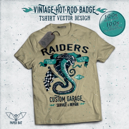
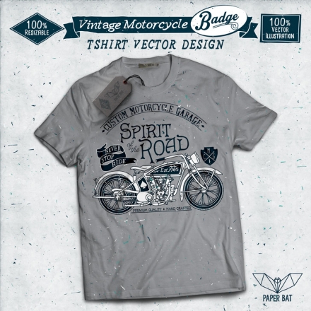
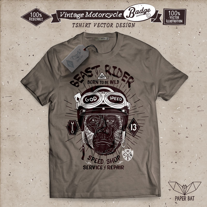
Vintage design illustration is almost a cliche but the more time passes, the better and higher the competition among designers. This style seems almost born to be featured in t-shirt prints. Which is why we discussed a little bit about it with Tshirt Factory contributing designer Pablo de Rosi, known on the site as PaperBat. I found it hard to choose the works to be included in the post, so go directly on his profile and see all of them, but only after reading our interview:
OANA: Please tell us more about your art and design background. What made you become a designer?
PAUL: Well, I began by drawing and realized I really liked it. Over time I began using the computer as a tool to digitize what I had previously drawn on paper, until I finally gave up the pencil and started drawing entirely on a digital platform. I started off by using programs such as Corel and over time I used illustrator and Photoshop. After a while, I began experimenting with typography, combining different styles along with my drawings and really liked the results.
OANA: How or when did you start illustrating on a professional level?
PAUL: I began working at an advertising agency 10 years ago. At first, I only designed logos for various brands, some of them even had mascots. After that, I began designing and illustrating all kinds of things.
OANA: Where does your inspiration come from?
PAUL: I look at a lot of design websites on a regular basis. Some of them include t-shirt designs, illustrations, artists, designers and typography dedicated web sites. I also get really inspired by my passion for motorcycles, race cars and vintage cars, too. I am also a big fan of comics and movies.
OANA: How would you describe your style?
PAUL: I always try to design using defined strokes and a reduced color pallet – the cleaner and simpler, the better. I combine this style with a high sense of realism and always add a kind of Rock (or Hard Rock music) feeling to it.
OANA: What tools do you use? Do you go 100% digital or is there paper involved?
PAUL: I go 100% digital. First, I start off by sketching on my Wacom tablet in Photoshop and then I make the final process on illustrator.
OANA: Is there anything that you specifically avoid using in your illustrations?
PAUL: Not really, the only thing that I try to do is to vary the themes that I use to draw, so that I am always innovating. This helps me avoid repetition or the use of popular or common elements of the time. Maybe what I try to avoid the most is the use of too many colors on my works and designs.
OANA: What was the hardest job/illustration you have ever worked on?
PAUL: Every job has its stalls. Most of the difficulties are along the final details where I try to simplify and clean the designs while adapting them to the number of colors the client disposes or wants. Maybe one of the most difficult drawings I had to make is the one with the skeleton grabbing a steering wheel. I had to do a couple of sketches until I finally got to draw the right pose that I actually found realistic.
OANA: Can you name some of your favorite designs and why? (personal or from other designers)
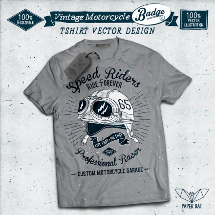
PAUL: One of my favorite personal works is the one with the vintage motorcycle helmet, with the sunglasses and the number 65 on its side. The typography I chose for this design blends perfectly with the personality I was going for in the drawing.
There is a design line called American Vintage Badges from a designer that goes by Opusnigrum that I really like and enjoy. I also like Thomas Crowley’s work posted on TShirt Factory’s website.
OANA: Any graphic designers you admire?
PAUL: I admire Opusnigrum and Thomas Crowley, which i both mentioned before. I also think that BMD DESIGN, Mike Cortes and Liberation Serif are good, among others.
OANA: Any words of advice for anyone just starting out as an illustrator/graphic designer?
PAUL:I believe that the most important thing to do is to look, search and take notes when you have an idea; this helps to understand and determine what you want to do before you start drawing and designing. The tools are also very important. The more you know them, the better the results. Having those two covered it’s all about practice, making mistakes and learning from them.
Leave a Comment