The world is evolving, and so are the people and everything that they do. As we said in an article about our new Pin-Up Girls Vector set, classic has a way in combining itself wit
h the present, and why not, even with the future. Nothing stays the same, everything changes. That’s exactly why the designers and the typography design artists tend to keep up, and transform everything old in something new and improved.
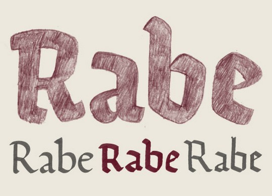
This is how Ode came to life! Exactly for this purpose, of transforming something old and dusty into something extremely readable, that graphic designers could use for diferent works and samples of their own. Ancient typing styles, such as Old English or Gothic are very popular this days, Ode being the perfect Frankenstein for this styles.

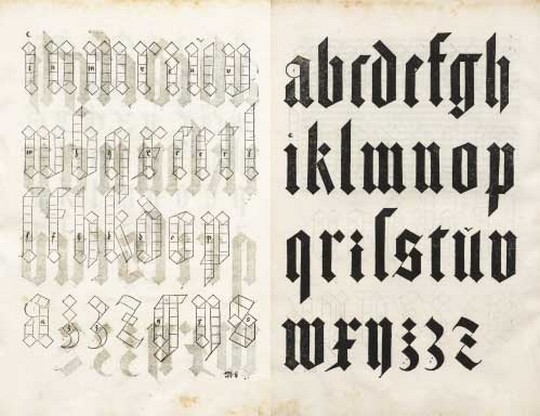
Ode is designed using some principles, for examples by exploring a construction rather than bringing back to life an existing idea. The smart thing in doing this is using the same tools used originally. You have to understand the past, in order to create the future.
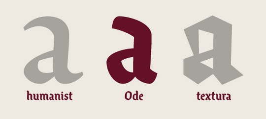
One of the various broken scripts, also the starting point of the typeface called Ode, was Textualis, wich was very easy to be constructed, but extremely hard to be read, beacause of its repetitve pattern, this pointing little personality. Also, in Textura, one of the problems was the high contrast, wich slowed down the eye.

The creator asked himself this question: an one design a good text typeface based on a writing model that doesn’t really lend itself as one? The answer was yes! He took the liberties to improve, and made a less orthodox approach (as he sais).
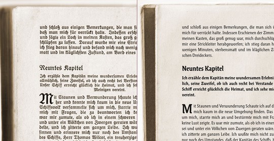
Ode presents itself as a smoother, organic and friendlier than previous similar styles. With its corners rounded off, Ode has more tension and it is much more agreable than its previous styles, having its letters slightly slanted on the right.
As we said, time are constatly changing, and it is absolutely normal to addapt ourselves to chages. In our oppinion, the Ode facetype is absolutely perfect for t-shirt models. We live in a time when t-shirt messages are very cool and popular, so, it is mandatory to use the perfect style to give our t-shirt more class and beauty.
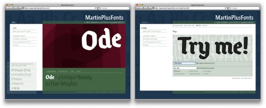
We invite you to read more about the Ode style and its creator, by checking out the author’s page!


Leave a Comment