That title came out of nowhere, didn’t it? It’s basically about typography combined with food, but we’ll get to it in a few moments. First of all, here’s a few things about Tyrsa:
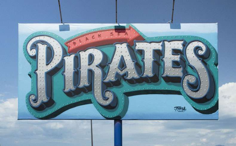
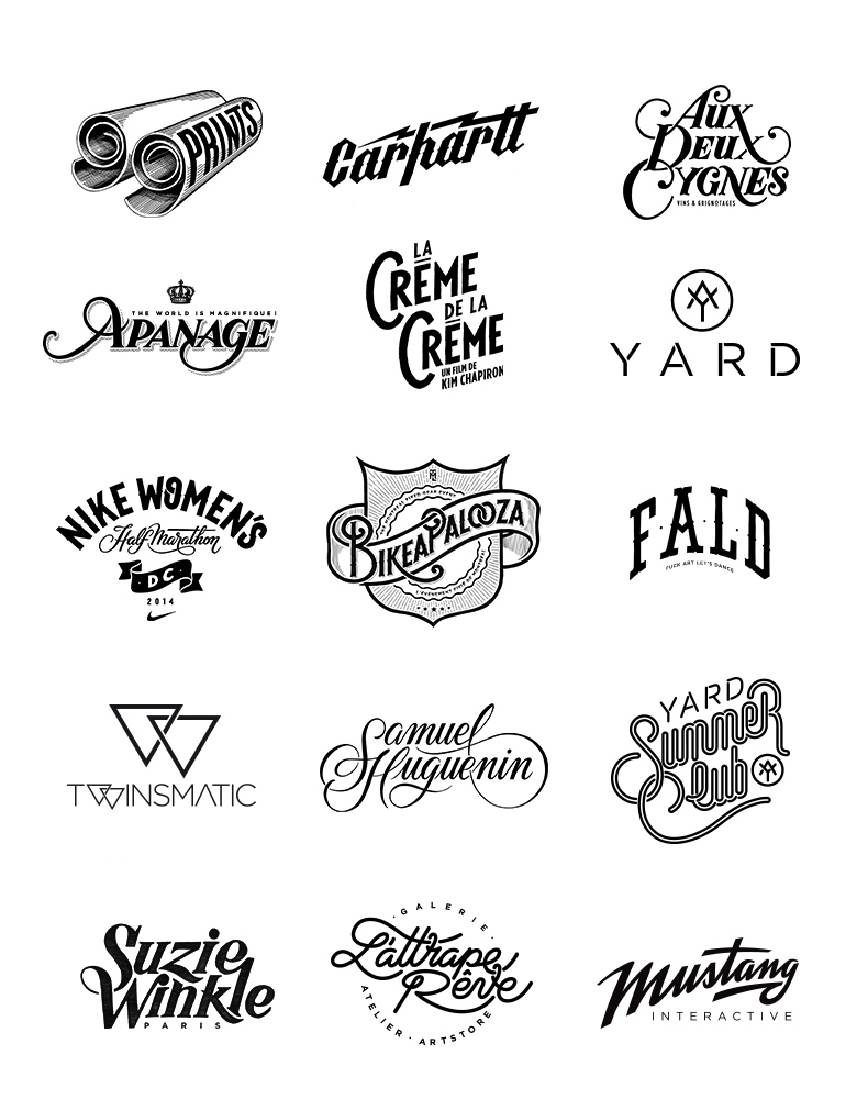
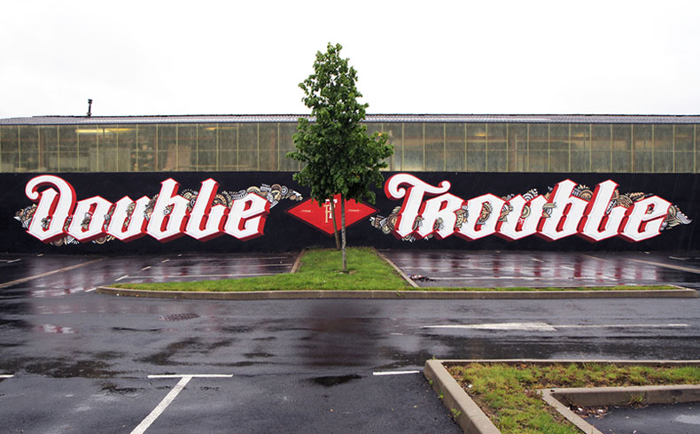
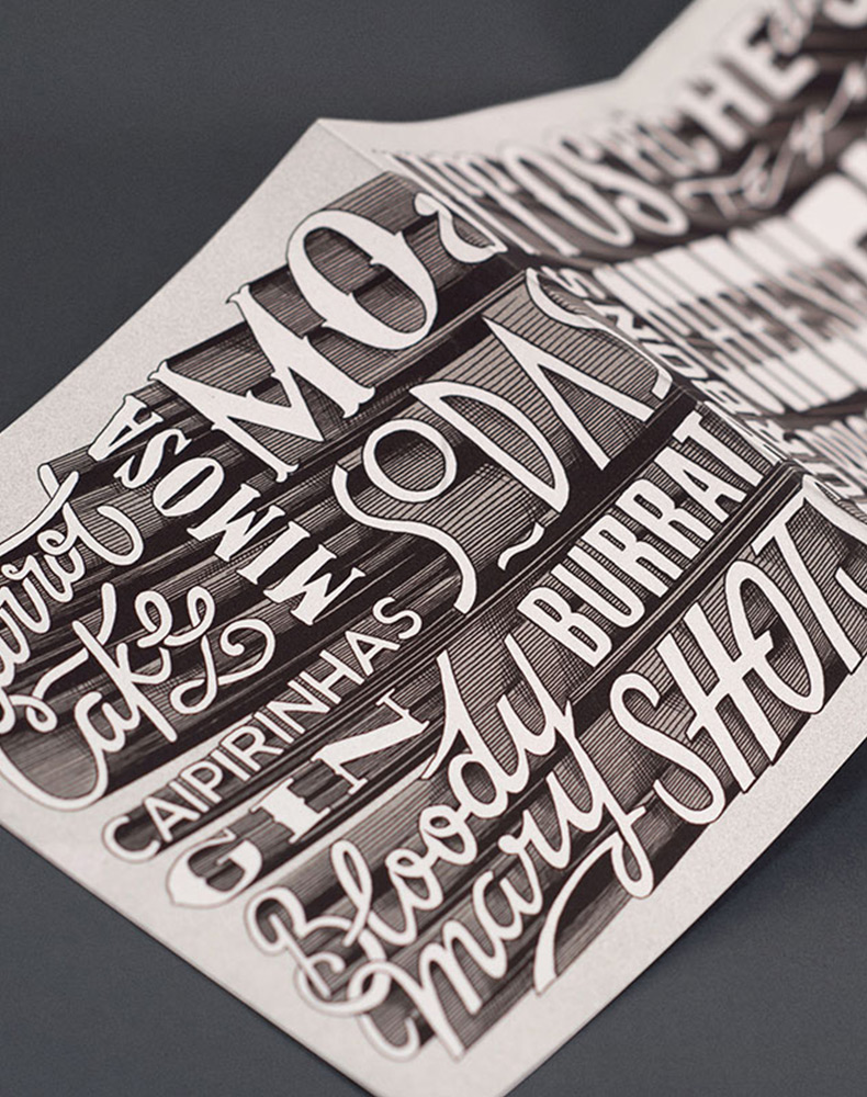
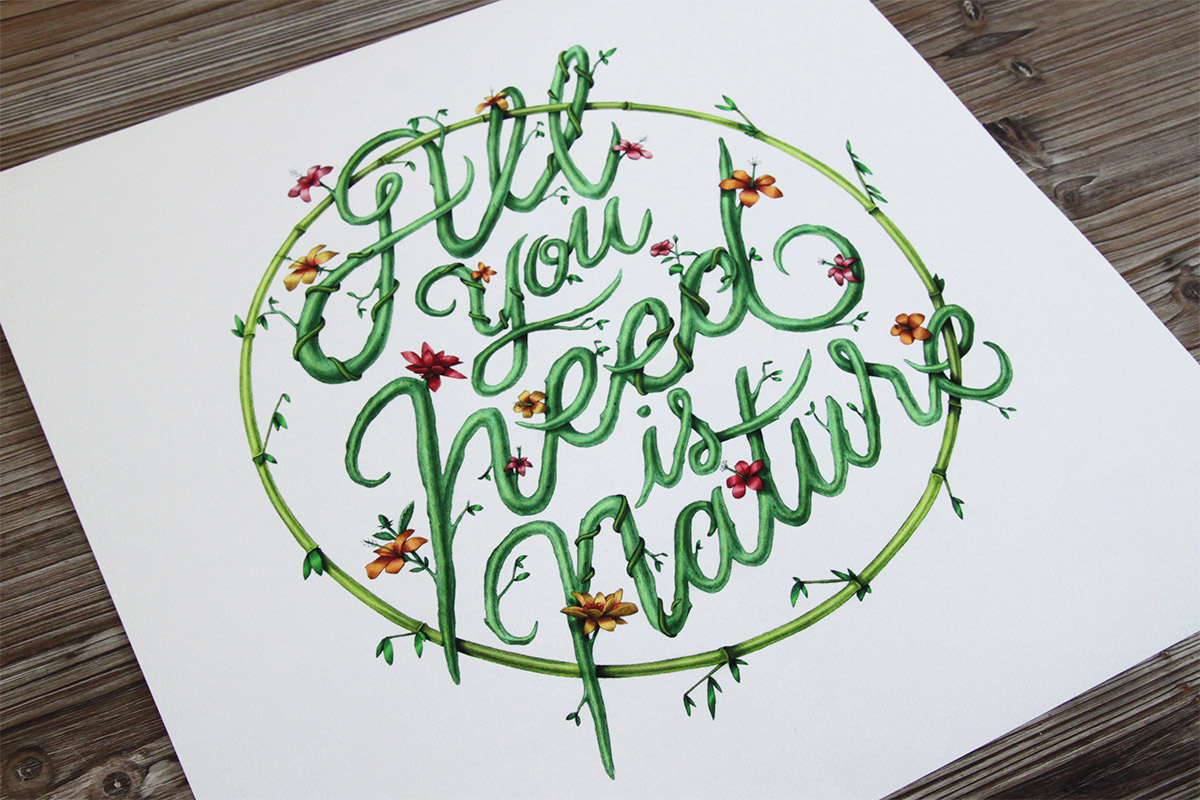
Alexis Taïeb – known as Tyrsa – discovered graffiti in the late 90s, and it was graffiti that led him to discover his natural talent and love of typography. He studied at the renowned Gobelins School in Paris, where he honed his unique and adaptable style with a focus on print and web design. Since graduating in 2007, he has amassed a versatile portfolio of work that showcases his engaging and precise visual style. Varied as it is, his work is linked by one simple goal – to reinvent the simple letter without losing any of its beauty or its meaning.
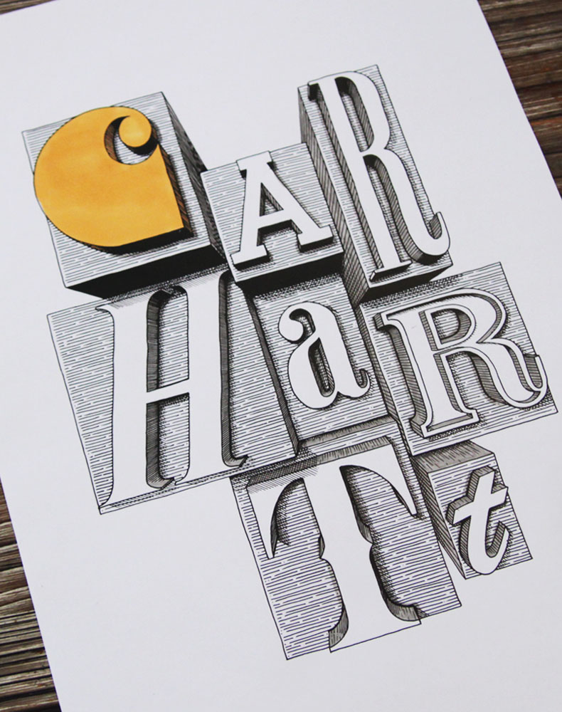
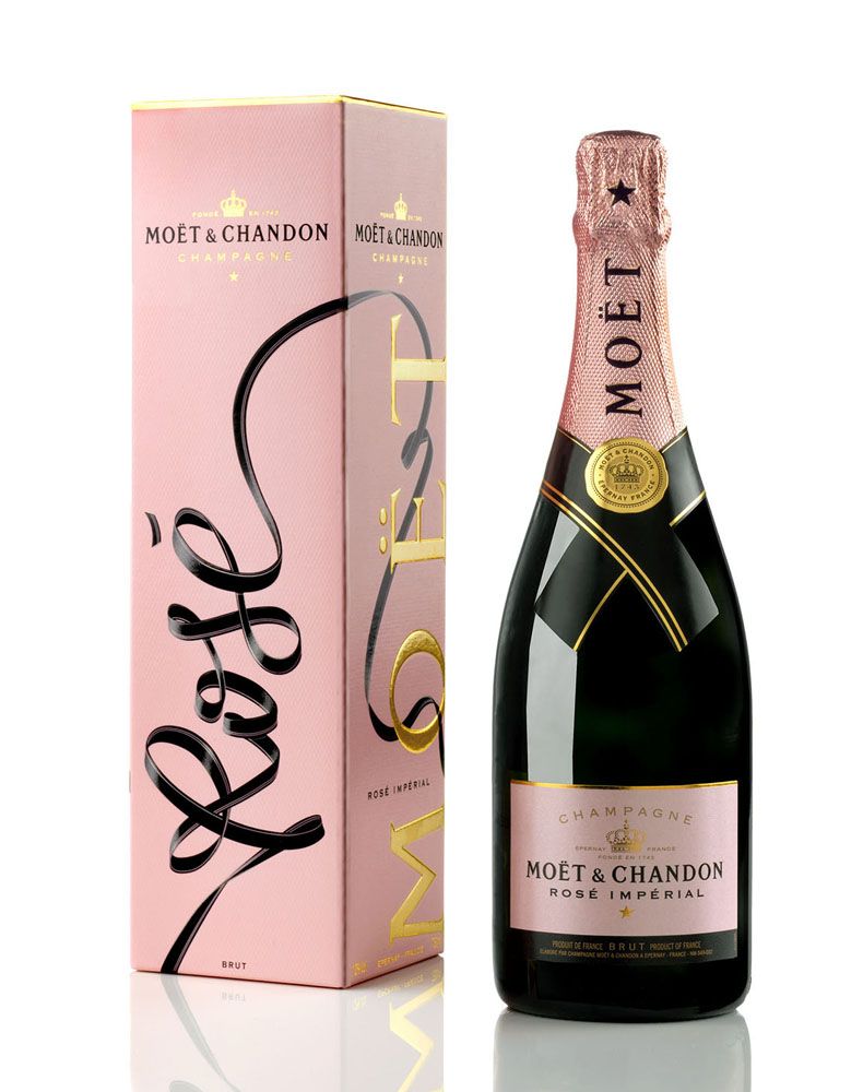
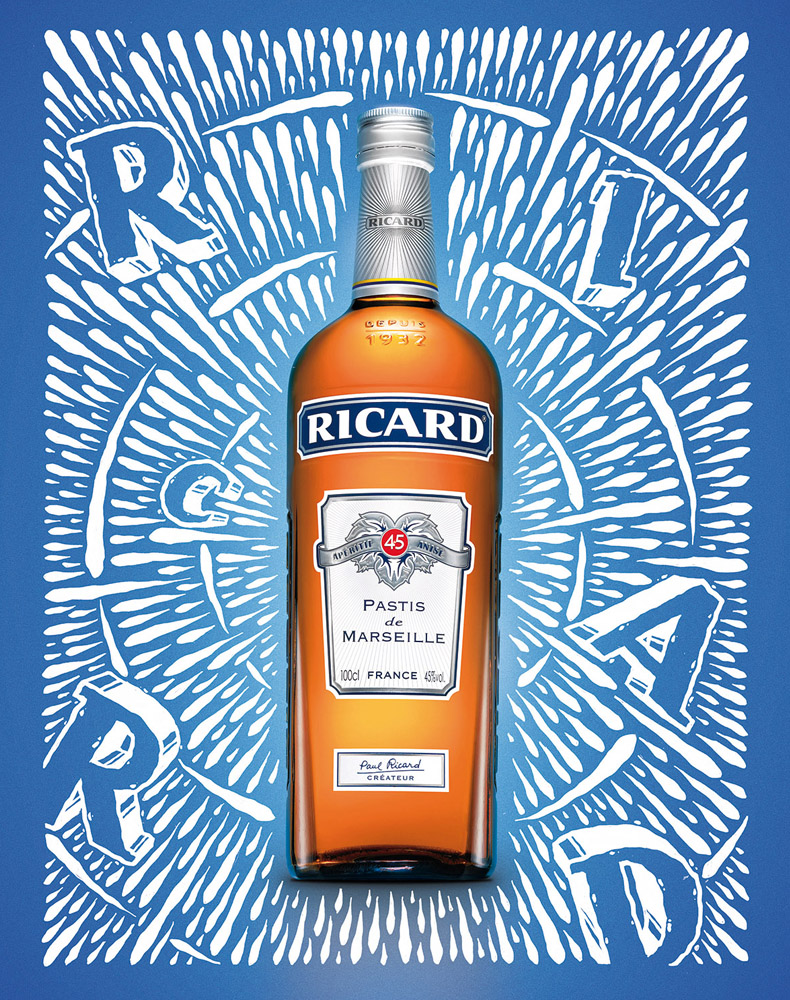
Alexis’s versatility and modern edge have led to work with Parisian agencies BETC Euro RSCG, Publicis, DDB, TBWA and Sid Lee, and his recent projects include designing logos and print campaigns for Jordan, Nivea Q10, Ricard and Adidas. Other clients include Carhartt, Coq Sportif, Moet & Chandon, Uniqlo and fashion label Bleu de Paname.
I really wanted to show you one of his latest projects involving the sweet heaven on earth that is the tiramisu italian dessert.
He worked on an Illustration for the TYRSAMISU pastry in collaboration with Liberté and chef pastry Benoit Castel Chef Pâtissier. The pastry was available at LIBERTÉ Vinaigriers 39 Rue des Vinaigriers 75010 Paris, France.
But if you have a sweet tooth and have a penchant for typographic design, here is one piece of good news. Check out his Facebook Post by Tyrsa.
This great shot of the TYRSAMISU is now featured in the new issue of Fricote Magazine.
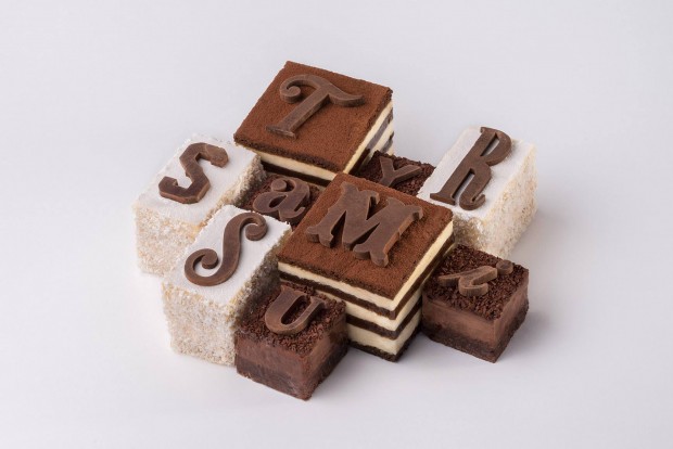
And, oh my lord, there is also the video for this collaboration – hold on to your drool!
Le TYRSAMISU | Tyrsa & Liberté from Axel & Julien on Vimeo.
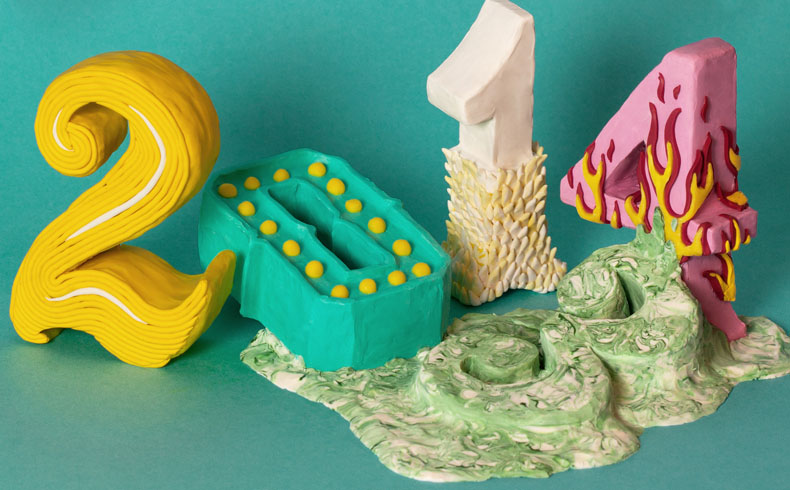
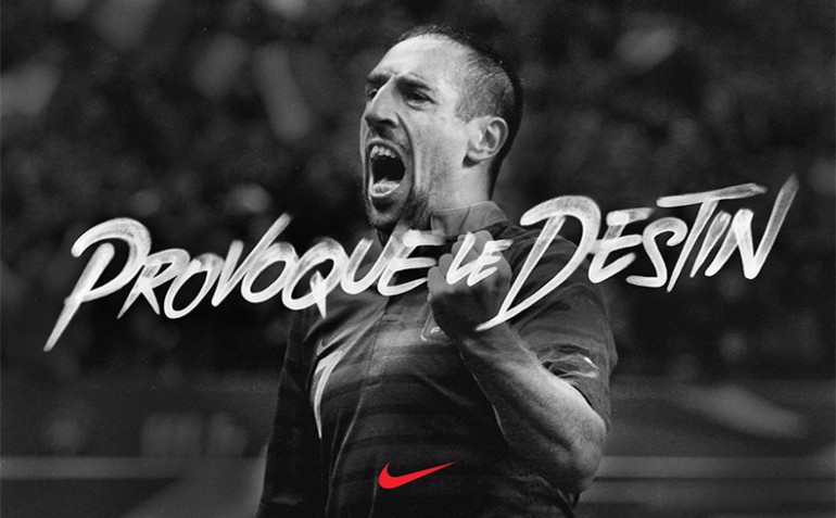
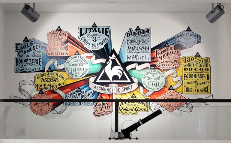
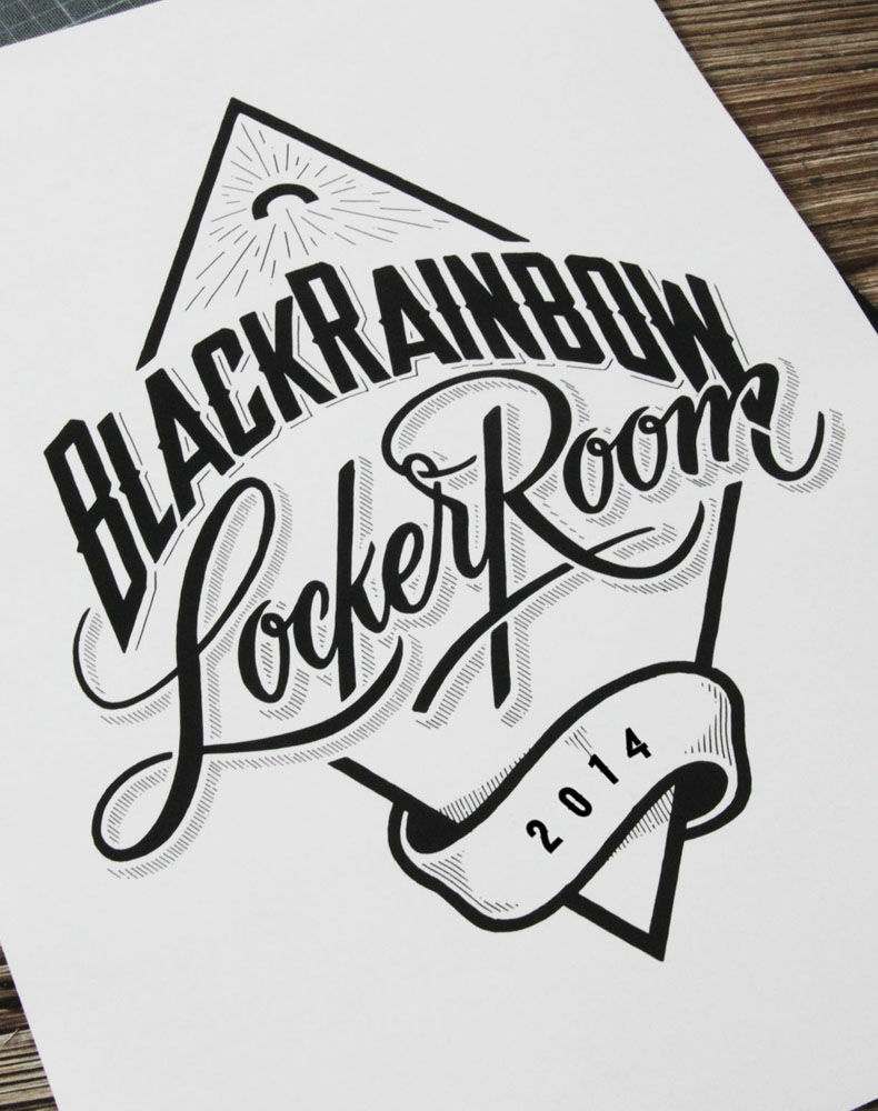
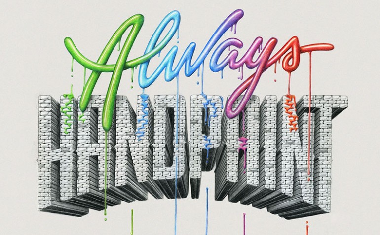
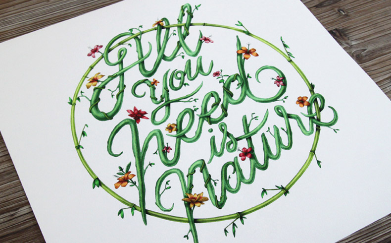
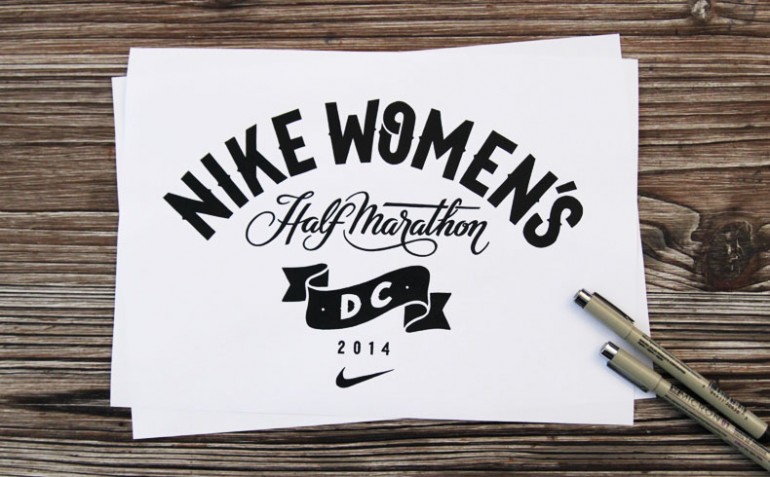
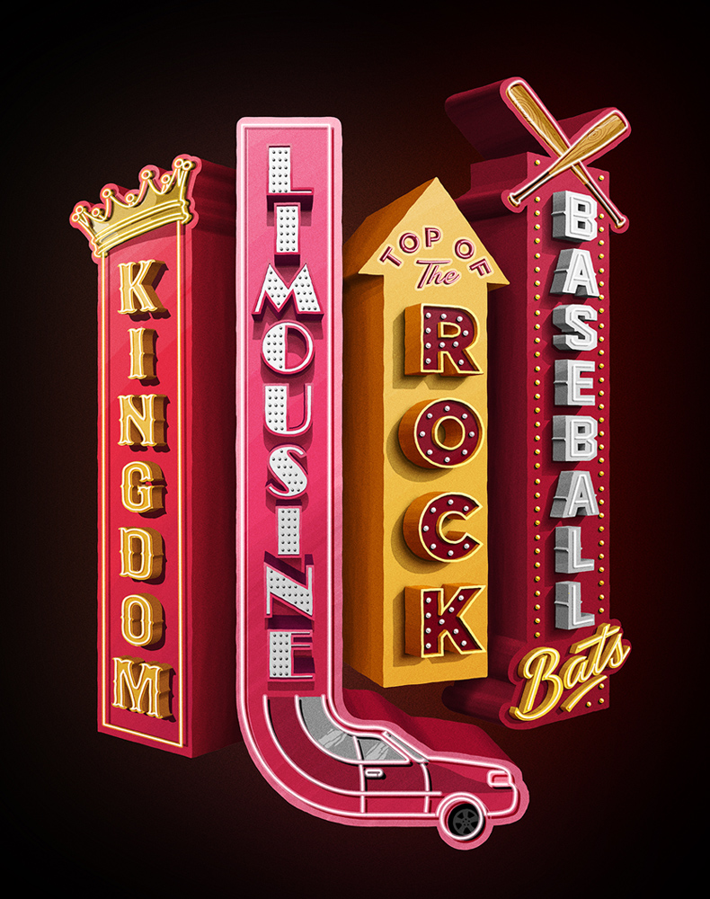
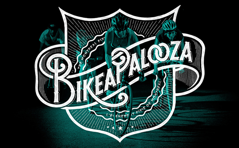
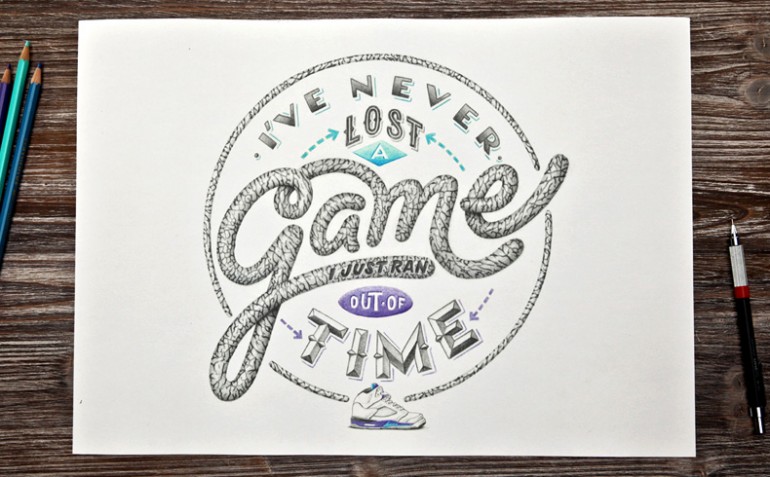
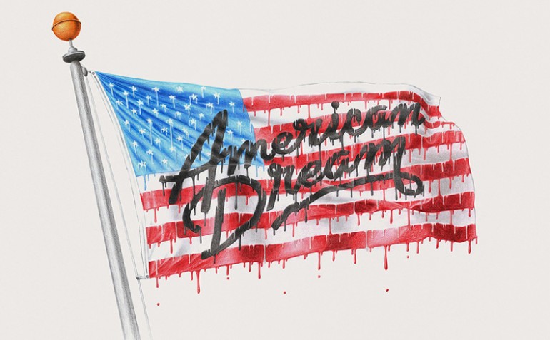
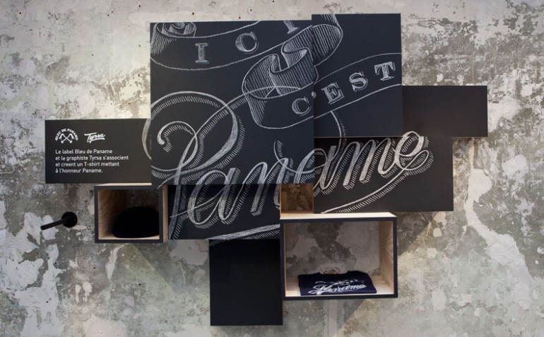
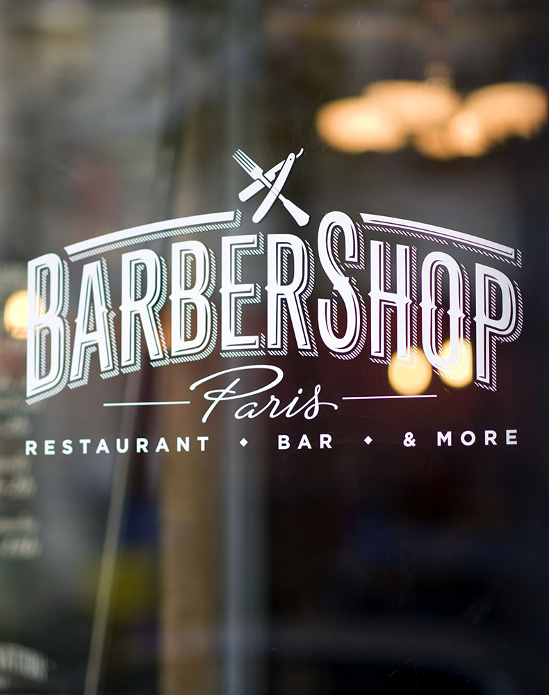
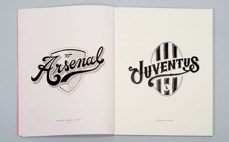
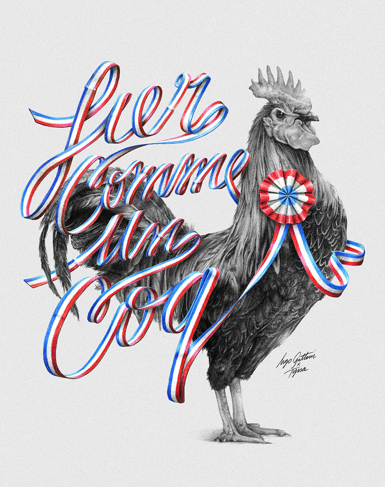
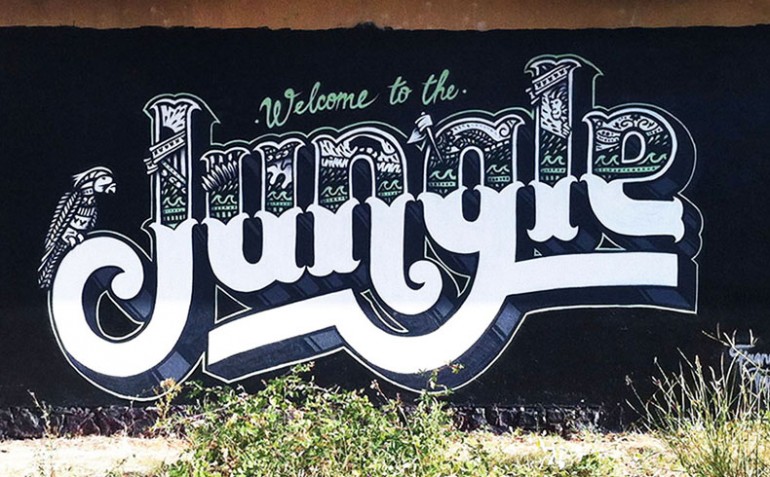
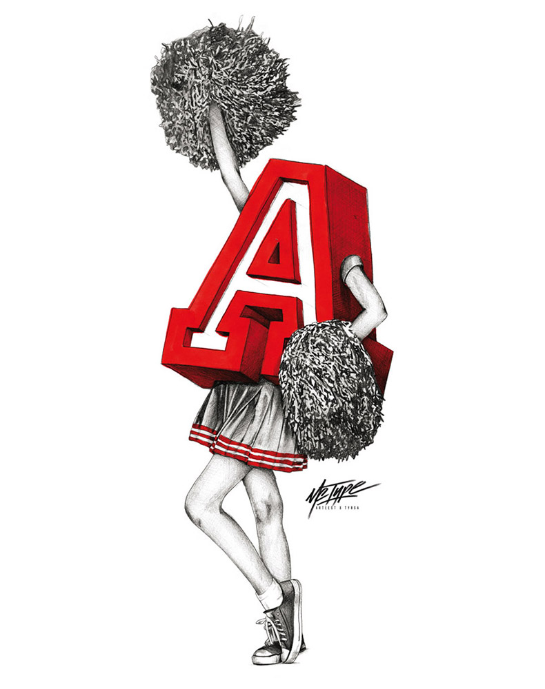
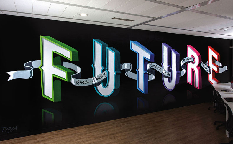
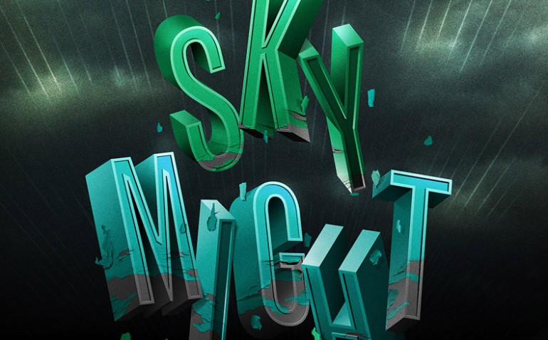
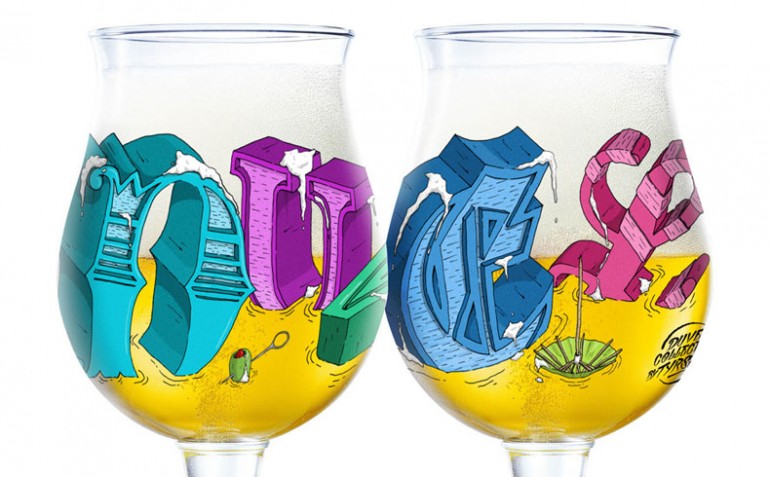
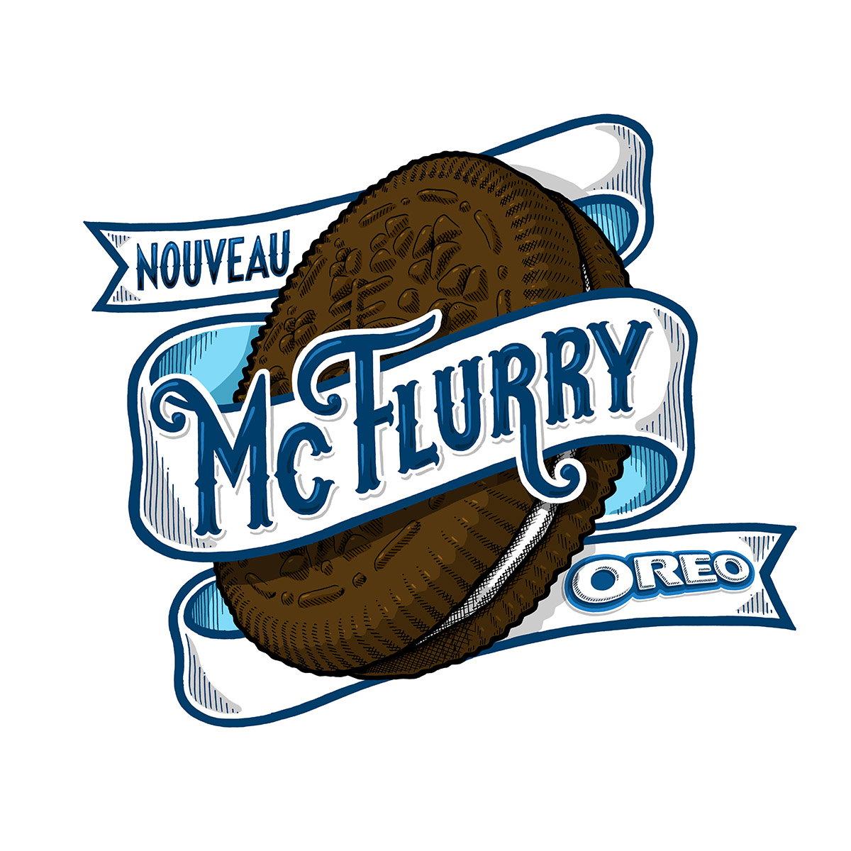
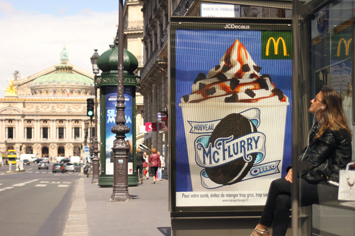
You can check out the great work of Tyrsa below:



Leave a Comment