Did you know many famous brands and companies chose to bring changes to their logos this year? Some of them you know very well, while others may not ring any bells. We selected the most prominent of them. It is fun to see the evolution of brand identity graphics each business giant prides itsel with, happening right before your eyes. Some of the changes were needed while others simply did not bring much to the table. But most of them meant simplifying the lines as well as the content, due to the notoriety of the brand.
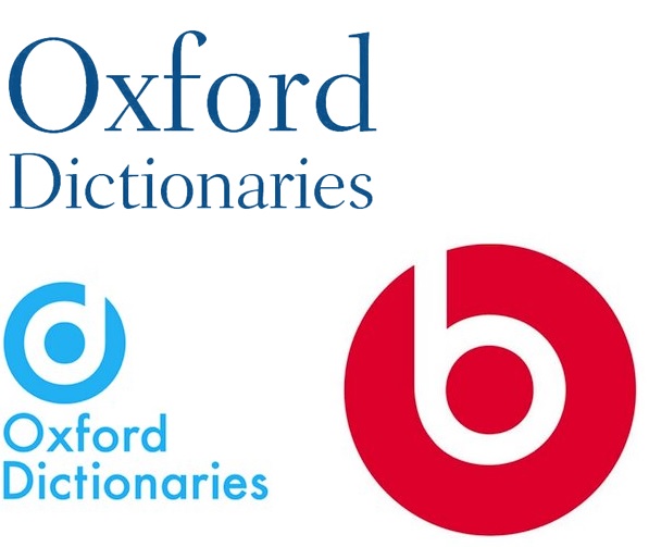
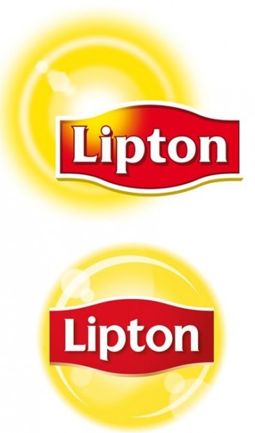
As with all changes, some brands nailed it while others just steered too far from the products they represent or are way too similar to other logos – such is the case for Lipton (the logo now resembles the Lay’s logo) or Oxford Dictionaries (the logo is a mirrored version of the Beats by Dre logo). Sometimes I wonder how these companies choose to green light such decisions, given the obvious confusion it may create. Is it on purpose or is it just plain lack of vision? What do you think? Which are the best changes and which brand totally missed the point? Show us other logo changes that we forgot to include below, in the comments.
2014 Redesigned logos of famous brands
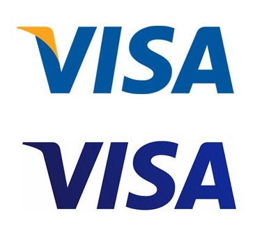
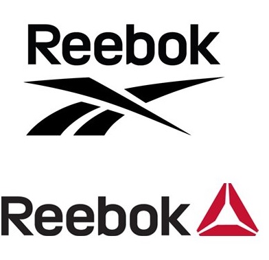
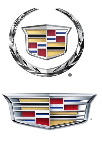
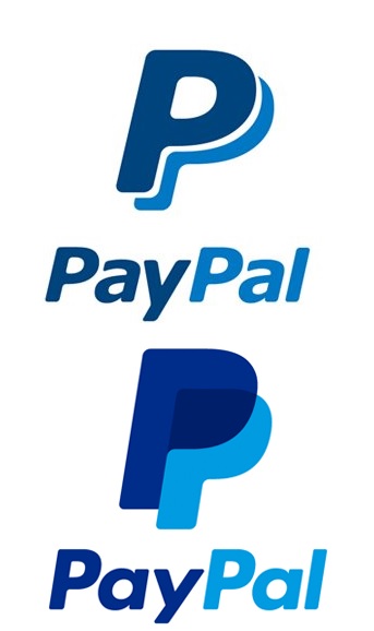
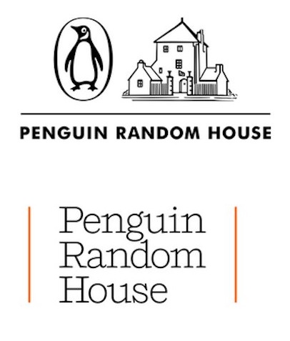
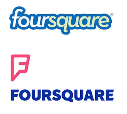
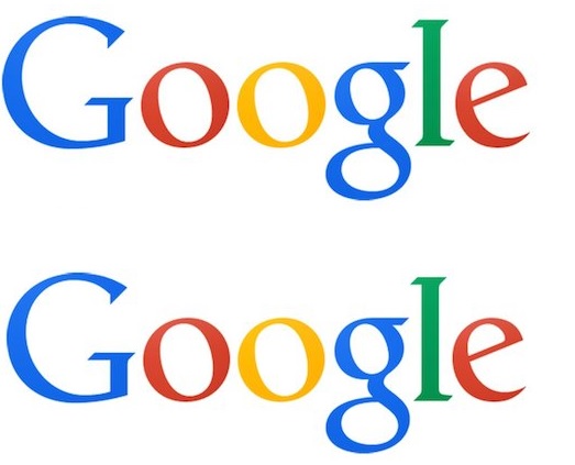
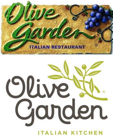
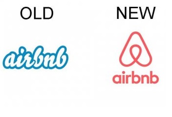
The upper image shows the old logo while the new logo is presented in the second image, for each brand.



Leave a Comment